


Além de ser um projeto extremamente forte, instigante e leve, a identidade visual desenvolvida para o Fórum Cultural tem como proposta principal ser composta por estruturas básicas muito eficientes e sólidas, sobre as quais diversos elementos gráficos e fotos são trabalhados. O resultado é a apresentação dos aspectos da realidade, espírito e valores tão presentes nos diversos espaços e vivências da escola com seus alunos, em suas diferentes fases de vida.
Em contraste com este excesso de informação visual, foi criado um padrão mais delicado, majoritariamente composto pela relação entre planos de cores pastéis e suaves.

O Site da Busch Amazon foi desenhado com base na identidade visual forte da marca, buscando extrair a energia da Floresta Amazônica e trazer para seu layout.
O site foi construído em apenas uma página, através do sistema de ancoragem, para que o usuário possa navegar sem mudar de página e ter uma experiência única e prática de navegação, contemplando e dando o devido destaque a todas as informações necessárias.
‘‘A Marca Busch Amazon nasce não tão somente como mais uma marca, ela nasce para oferecer os melhores e mais puros produtos possíveis, pois nasce com o DNA da maior floresta do mundo!’’
CARTILHA DO
PRIMEIRO EMPREGO
LIVRO COMEMORATIVO
LASSBIO 20 ANOS
LIVRO COMEMORATIVO
LASSBIO 20 ANOS
LIVRO COMEMORATIVO
LASSBIO 20 ANOS
LIVRO COMEMORATIVO
LASSBIO 20 ANOS
LIVRO COMEMORATIVO
LASSBIO 20 ANOS
EVENTOS E CAMPANHAS
EVENTOS E CAMPANHAS


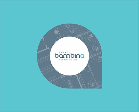

O que o cliente desse serviço procura é um espaço
com qualidade, conforto e infraestrutura. Assim, o
desenho da planta do espaço se torna mais do que
um elemento ilustrativo, se transforma em um
elemento instigante, no qual o cliente verá
simbolizado exatamente o que ele procura.
As plantas utilizadas são as do Espaço Bambina,
retratando a distribuição atual e outras possibilidades de organização do espaço. Tal tratamento gráfico personaliza a Identidade Visual e mostra a riqueza e variedade de opções que a empresa oferece.
As diversas peças de comunicação apresentam uma variedade de espaços dos diferentes andares do Espaço Bambina.


xxxxxxxxxxxxxxxxxxxxxxxxxxxxxxxxxxxxxxxxxxxxxxxxxxxxxxxxxxxxxxxxxxxxxxxxxxxxxxxxxxxxxxxxxxxxxxxxxxxxxxxxxxxxxxxxxxxxxxxxxxxxxxxxxxxxxxxxxxxxxxxxxxxxxxxxxxxxxxxxxxxxxxxxxxxxxxxxxxxxxxxxxxxxxxxxxxxxxxxxxxxxxxxxxxxxxxxxxxxxxxxxxxxxxxxxxxxxxxxxxxxxxxxxxxxxxxxxxxxxxxxxxxxxxxxxxxxxxxxxxxxxxxxxxxxxxxxxxxxxxxxxxxxxxxxxxxxxx

A Identidade Visual da Fernanda Bernardo Jóias apresenta a marca como referência em exclusividade, bom gosto, sofisticação e luxo.
A Marca e os elementos visuais desenvolvidos propõem uma atmosfera de valorização dos detalhes e do processo de criação de cada peça, desde o desenho inicial até a produção e acabamento.
A comunicação a ser desenvolvida apresentará a determinação da equipe Fernanda Bernardo na busca constante pela perfeição em beleza, qualidade e requinte.
Os produtos da Marca serão considerados verdadeiros privilégios para quem os usa.

AO MESTRE,
COM CARINHO


INCT-INOFAR is a group formed by more than 40 laboratories, research and teaching institutions, in Brazil and abroad, with 2 operational focuses: the development of new drugs and the development of generic drugs.
With very specific demands from the academy and the goals of publicizing the group's actions to the national and international environment; to present the results of the work to the incentive and promotion agencies and act with the general public against the culture of self-medication, several communication, promotion and events actions are developed by INCT-INOFAR


The 2009 report marked the beginning of the work of Claudio Ventura Studio with the National Institute of Science and Technology for Drug Innovations (INCT-INOFAR).
With a graphic project aligned with the most current text formatting, image processing and layout in the world, the publication reached the international chemical community and presented the Brazilian group as an important worldwide reference.
The edition also marked the beginning of the use of Don Quixote as a mascot for the reports. A personalisation of all the spirit of the search for science, a characteristic so remarkable in the performance of INOFAR researchers.


Keeping the quality standard established in the 2009 Annual Report, the following editions have always had a high degree of demand to be achieved.
Always showing an innovative graphic design of the works developed by INOFAR, the publications and multimedia created as annual reports of the following years were eagerly awaited by the Brazilian scientific community.


The work created by Claudio Ventura Studio for the 2015 INOFAR Annual Report was a milestone.
All developed in infographics with a very striking color palette and a unique and innovative graphic design, the work presented a visual proposal that resulted in important quotes, new projects and invitations for the Studio to talk about its entire creative and development process of the projects.


AND FOR CHILDREN...
In the field of popularisation of science and the conscious use of medication, Claudio Ventura Studio developed a series of products and marketing pieces to work with or without the actions of the INCT-INOFAR events team.
For the children, the Studio created a collection of comic books featuring the character Zequinha and his gang on fun adventures that always have the conscious use of many different medications as a background.
At the end of every comic book from Turma do Zequinha there is a series of activities and puzzles for children to have fun and apply the lessons learnt from the magazine.


LASSBIO
20 years
One of the main laboratories of the INCT-INOFAR research network is LASSBio, which, when celebrating its 20th anniversary, received a special present.
Hired by the laboratory, Claudio Ventura Studio developed a limited edition commemorative book that recorded the history, not only of the laboratory itself, but also of the main scientists and professors who worked for LASSBio. A work that has become a book of references and memories for all those who wrote the history of this important Brazilian scientific research institution.


A small, easy-to-read book, released digitally and printed, able to quickly present what INCT-INOFAR is and its importance for the field of medical chemistry research in Brazil and worldwide. The booklet is a publication that, through a few pages, conveys its message and introduces the reader to this important group of researchers, coordinated and almost entirely formed by Brazilian scientists and professors.


A work capable of crowning the history of the most important Summer School focused on Brazilian Pharmaceutical and Medicinal Chemistry, a history recognized and referenced by many of the most important chemists in the world. A decisive school in defining the careers of thousands of young people.
To solve this challenge, Claudio Ventura Studio created a large format book that simulates a notebook of a student who hypothetically would have attended several, if not all, editions of the event.
The result?
The perfect synapse between the city of Rio de Janeiro and Medicinal Chemistry, in a work full of illustrations and photos, presented by a text that is more than relaxed and captivating!
All led by a unique layout, worked on an exceptional graphic project!


